

Gorgeous Gorgona is a premium nail salon concept that redefines the intersection of meticulous cosmetic craftsmanship and luxury lifestyle hospitality. Rooted in the poise of Greek mythology, the salon positions itself as an urban sanctuary of symmetry, form, and excellence for the modern cosmopolitan woman.
As the Lead Brand Designer & UI/UX Strategist, I was responsible for the complete 360-degree brand launch. The scope of work encompassed deep brand strategy, including architecting the brand persona, voice attributes, and core personality, alongside the execution of a 40+ page brand book, a custom typographic visual identity, and the full responsive UI/UX design for their desktop and mobile web platforms. The final digital product successfully elevates a routine booking service into a premium, frictionless personal ritual.
PROJECT OVERVIEW & EXECUTIVE SUMMARY
-
Role: Senior Brand Designer & Strategist
-
Deliverables: Brand Strategy Framework (Persona, Voice, Personality), Core Visual Identity, 40+ Page Brand Book, Responsive Website UI/UX (Desktop & Mobile), Component-Driven Figma Design System.

THE CHALLENGE
The beauty and nail salon industry is oversaturated with predictable pastel palettes, chaotic booking interfaces, and generic templates that feel superficial and purely transactional. Gorgeous Gorgona required a profound departure from these industry clichés to appeal directly to a highly discerning, design-aware, and affluent clientele.
The project presented a multi-layered design challenge:
-
Define an Abstract Identity: Translate the raw, mythic authority of the Gorgona into a highly sophisticated, modern verbal and visual narrative
-
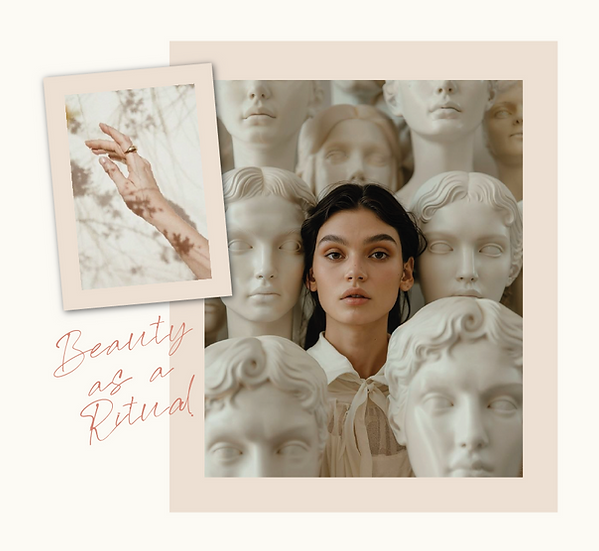
Translate Space into Pixels: The digital interface had to mirror the physical salon's atmosphere, evoking serene minimalism, absolute hygiene, and high-end art direction.
-
Frictionless Mobile Booking: Because over 80% of salon bookings occur on mobile devices, the mobile layout required a fast, intuitive UX architecture while preserving an elite, editorial aesthetic.
THE STRATEGY & VERBAL BLUEPRINT
To ensure the visual elements carried real emotional weight, I anchored the creative process in a rigorous verbal strategy phase. I defined the core brand archetype as "The Urban Muse", magnetic, graceful, and discerning.
-
Brand Personality Traits: I established a distinct matrix of core traits: Elegant, Meticulous, Caring, Cultured, Magnetic, and Cosmopolitan. This framework guided how the brand behaves in its physical space and how it treats its community.
-
Brand Voice & Copywriting: I engineered a disciplined verbal identity characterized by being Polished, Confident, Sensory, and Warmly Professional. I established strict copywriting guardrails, mapping out "Words to Embrace" (e.g., sculpted, ritual, elevated, connoisseur) versus "Words to Avoid" (e.g., cheap, quickie, cute, ordinary) to protect the luxury positioning across all future marketing touchpoints.
-
The Brand Persona: I drafted a comprehensive profile of the ideal client. A sophisticated individual who views self-care as a non-negotiable ritual and values craftsmanship in all forms. This persona ensured that every digital and physical touchpoint resonated deeply with the target audience

THE SOLUTION & DESIGN EXECUTION
A. Comprehensive Brand Book & Core Visual System
-
Typographic Wordmark Refinement: Rather than rebuilding the core mark from scratch, I precisely refined the existing typographic logo. I adjusted the letter spacing, proportions, and visual weight to strike a perfect, clean balance between classical authority and urban edge.
-
The Color Ecosystem: Developed a sophisticated, grounded primary color palette that ensures high contrast and digital accessibility. The system utilizes Deep Charcoal for crisp readability, Soft Ivory for spacious background breathing room, and a warm, natural Desert Sand as an intentional digital accent color.
-
Typography Hierarchy System: Structured a highly disciplined, multi-tier typographic system within a comprehensive 40+ page Brand Book. I paired high-fashion, clean sans-serif typefaces for display headers with a structured, legible serif for body layouts and delicate editorial scripts for premium moments.
-
Bespoke Graphic Asset Suite: Engineered a massive library of modular design components, including 40+ clean linear nail-care and beauty icons, custom geometric framing vectors, and repeating linear patterns used to wrap tactile physical use-cases like premium packaging, luxury shopping bags, and stationery covers.
-
Social Media Campaign Templates: Designed an entirely unified suite of premium social media post and story templates. These layouts seamlessly blend editorial typography hierarchies with clean crop-frames for lifestyle photography, giving their internal team a plug-and-play toolkit to run a consistent, elevated grid.


B. Full Responsive Web Redesign (Desktop & Mobile)
-
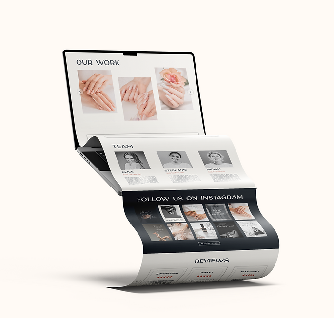
Complete Website Redesign: Abandoning the limitations of their old online presence, I completely overhauled the entire desktop and mobile web interface to build a content-forward digital platform that reads like a premium fashion editorial.
-
Desktop Layout Architecture: The redesigned layout utilizes a spacious grid framework with generous negative space and micro-interactions designed to elegantly lead high-end users directly toward the salon's premium booking pipeline.
-
Mobile-First UX Optimization: Because over 80% of salon clients access the site via phones, the mobile user experience was radically simplified. I stripped away unnecessary navigation layers, enlarged interactive touchpoints, and mapped out a clean, multi-step booking flow that eliminates user drop-off.
-
Component-Driven Figma Design System: Engineered the complete web project from the ground up using an atomic design system in Figma. Every responsive state, UI button, form element, and typographic style was fully systemized as a reusable master component to allow for seamless, developer-ready handoff.


THE BUSINESS OUTCOME
The implementation of this comprehensive verbal strategy, cohesive brand architecture, and digital platform successfully positioned Gorgeous Gorgona at the absolute peak of its market. By defining the brand voice and persona early on, the salon's internal team launched their marketing with absolute consistency. The resulting pixel-perfect web experience drastically minimized booking friction, leading to a highly optimized online acquisition funnel. The unified visual and verbal language, flowing effortlessly from the Instagram grid to the mobile interface and onto the physical product packaging, established deep customer trust and successfully transformed a simple nail appointment into an elite lifestyle experience


